Using Colour
by Megan Thriepland
Colour is defined as the effect given off by light on a surface. There are lots of ways you can modify the perception of space and objects by using colours together.
If you'd like to know more about colour before reading this article, click the link below.
Here are some of the ways to use colour to achieve different visual goals :
Using colour to minimize or obscure objects
Dark colours seem smaller and occupy less visual space, whereas lighter coloured objects seem larger. This applies to rooms as well, darker rooms often seem cosier and lighter rooms often come off as larger and brighter.

As seen in these two versions of this bathroom, a white vanity stands out against the dark blue walls whereas the black vanity seems smaller and blends in with the dark walls.
Using colour to create focal points
The easiest way to create a focal point is to use contrast. There are many types of colour contrast such as contrast between light and dark colours, warm and cool colours, saturated and muted colours and complimentary colours.

This picture is an example of this, as the high contrast of light and dark on the art of two horses stands out and becomes what the eye is drawn to.
Using colour to separate one area from another or to delineate space
Creating separate areas within one space is best done with different colour schemes

This room uses different wall colours and flooring to create the illusion of separation. The living room is defined by wood flooring and orange walls, while the living room features beige walls and a white carpet. Although both spaces occupy the same room, the drastic change in colours divides the rooms visually.
Using colour to create continuity between separate areas
Using a consistent colour scheme in two space creates continuity. Whether you're looking to create consistency within multiple rooms or unify two spaces in one room, a constant colour place strategically can achieve this.


Hi! I'm Megan, Owner of Blue Pearl Staging and staging decorator. In my BLOG you'll find helpful information on decorating, tips for home staging, DIY projects and much more.
SIGN UP
Subscribe here to receive all my new BLOG posts
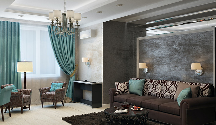
Contrary to the last example, this space has used colour to unify two spaces in a room. The blue featured in the curtains and cushions on one side match the throw cushions on the sofa. This creates visual harmony.
I hope you've learned a few tips and tricks on using colours to achieve your goals in your home. If you are interested in learning more about colour and how it affects visual space see these articles:


